Work on medicine packaging for kids is not easy. Drugs for kids could be scaring.
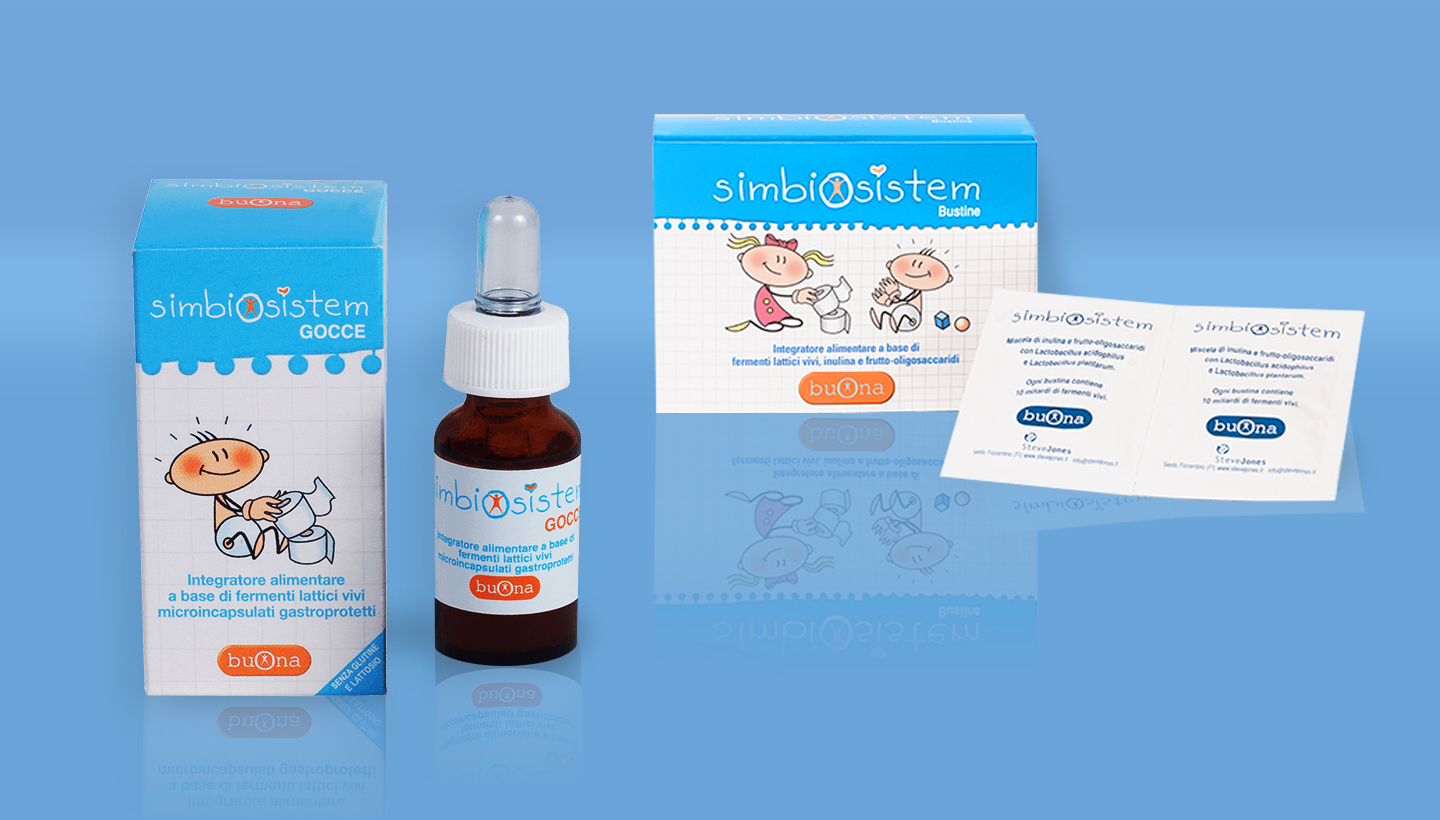
Buona decided to build is own corporate image to reassure the potential consumer with clear references to a child’s drawings.
Once I had to design packagings for new lines of product I had to follow the corporate image.
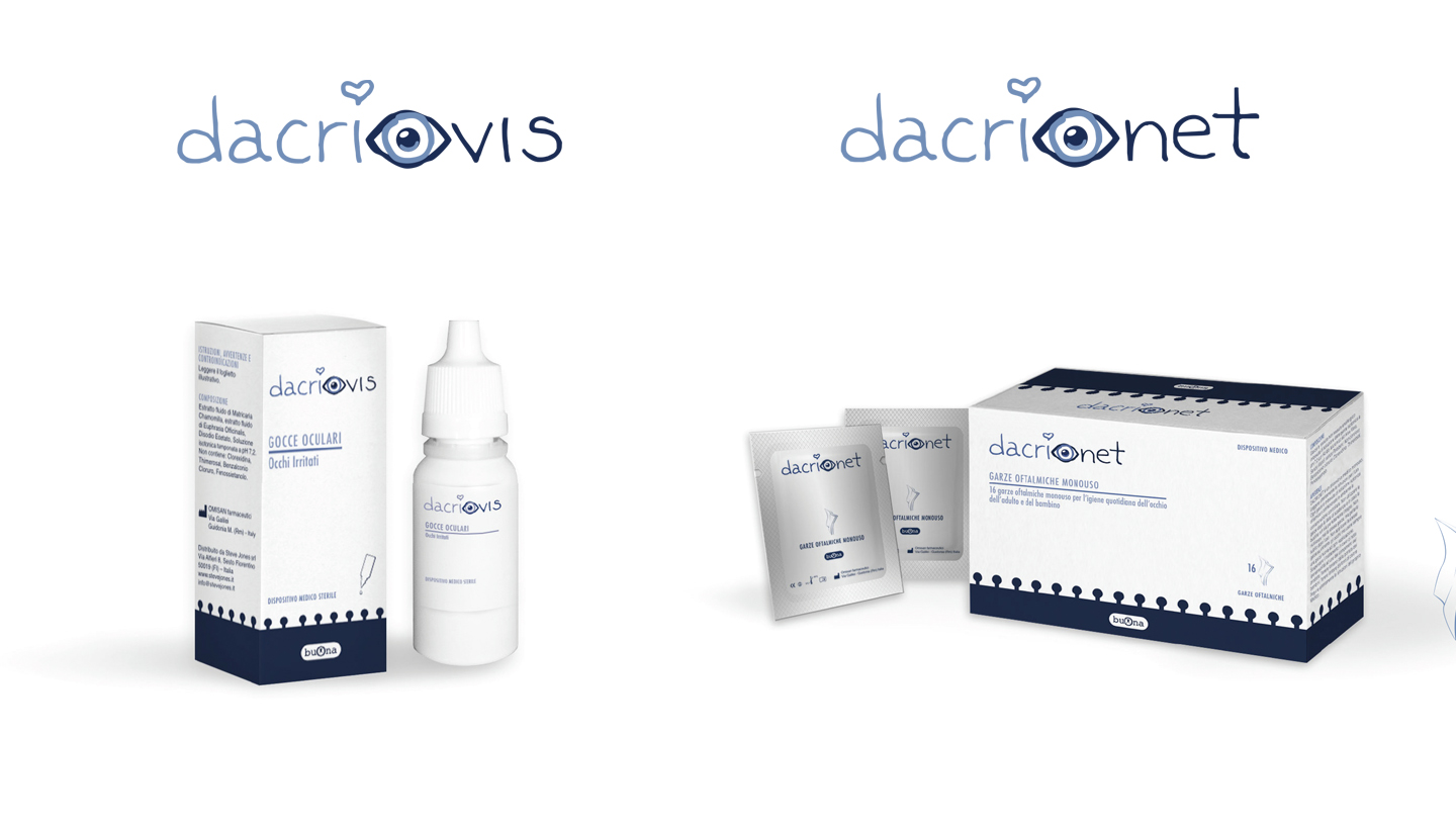
Dacrio product was a challenge. It is a product for kids and adults at the same time. It had to be recognized as a Buona product but not childish as the other products of the brand are.
I created a mixed style. Citing the Buona ‘family feeling’ with essential elements but designing the rest with an essential style.


